Excel Projects
Project 1: Call Center Dashboard
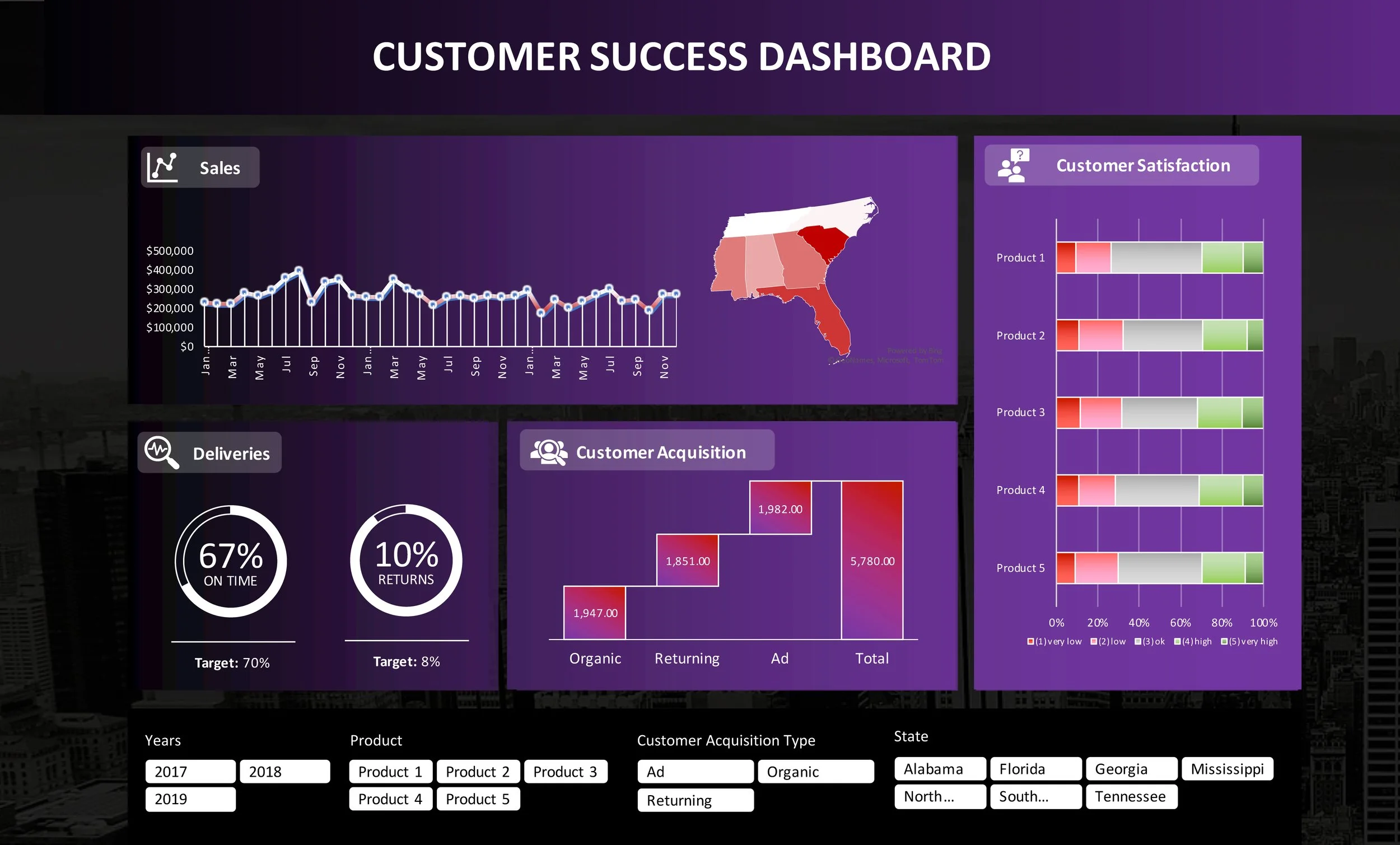
This is an interactive call center dashboard I made for my midterm project in my Data Analysis class in Fall 2021. I was only provided with the raw data and told to make a dashboard. I processed the data to find trends using pivot tables of various designs, along with charts including filled maps, waterfall charts, donut charts, bar charts, and line charts. I then created a master dashboard with interactive graphs, dropdown menus, and buttons which all link back to the corresponding sheet where that data was analyzed.
Click here to view full project.
Project 2: Spotify Analysis Project
This is an interactive call center dashboard I made for a project in my Data Analysis class in Fall 2021. I was provided with the raw data of Billboard Top 100 songs and albums for 2000, 2005, and 2010-2019, along with the number of Spotify Premium subscribers from 2011-2019. The assignment was to figure out whether or not the number of Spotify Premium subscribers is causing songs and albums to get shorter. I sorted and organized the raw data, then found the average length of song and average album length for each year. I then processed the data using regressions, t-tests, and ANOVA to find what data was statistically significant. Once I identified the statistically significant data, I analyzed the trends among that data by creating a master sheet with an easy-to-read chart showing the length of song and album compared to Spotify subscribers. On that sheet I also included scatterplots with trend lines, as well as bar charts with trend lines.
